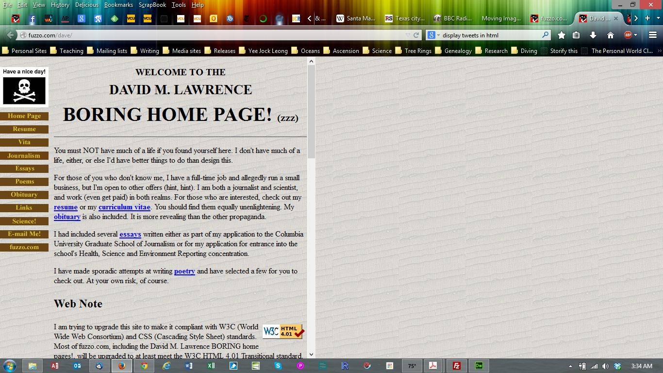
DavidMLawrence.com was originally intended to be a component of my original Web site, fuzzo.com. That site went through a number of iterations in design. Initially it was a purely personal site whose design was influenced by my work as a dendrochronologist (tree-ring scientist). The background was derived from an image of tree rings. The colors in the buttons call to mind colors that can be seen in wood, bark, and foliage. And the "Have a nice day!" logo did—still does—reflect something of my personality.

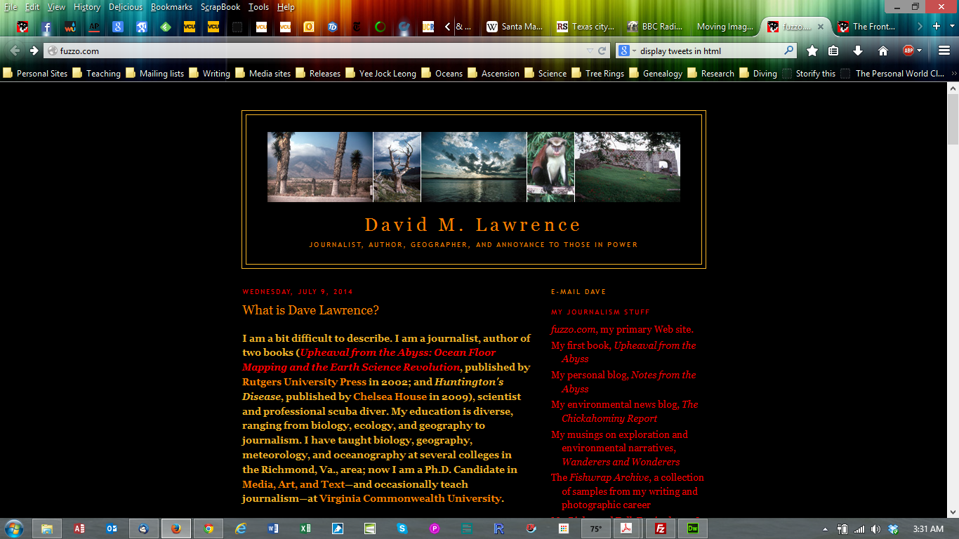
I stuck with the tree-ring design for quite some time. Eventually, however, I longed for a different look and—inspired by my early forays into Blogger—adopted a blog-style interface with a banner and a right-side navigation bar much like you see here. I also had a desire to present photographs in a manner that allowed them to stand out from their surroundings. That led to the development of my "milkweed bug" color scheme (oranges, yellows and reds on a black background) that I still use on fuzzo.com.
In August 2010 I enrolled in the Ph.D. program in Media, Art, & Text at Virginia Commonwealth University. One of the requirements for the program at the time was the development of an electronic portfolio in which we were to demonstrate a basic competence in multimedia techniques, such as writing, Web presentation, audio and video production, and animation.
Hence what you see here.
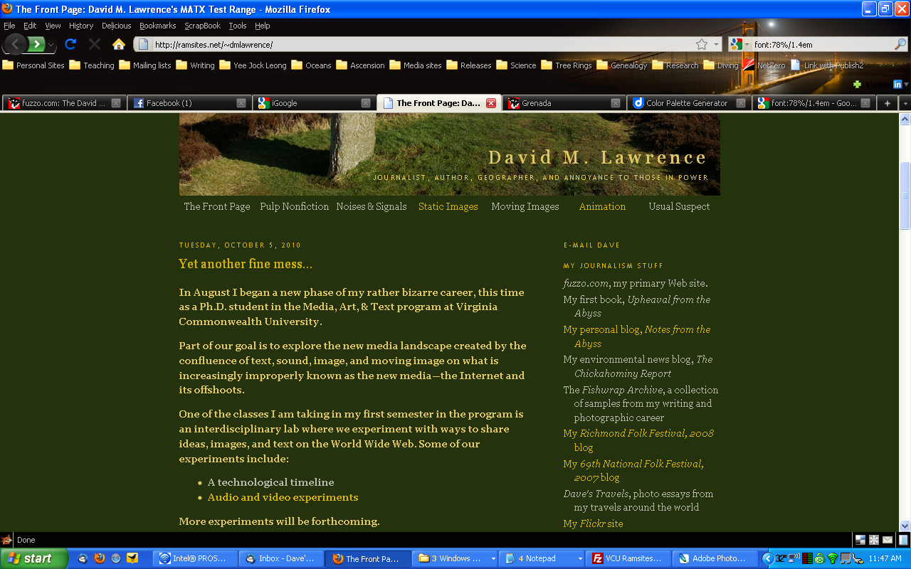
I designed this site using two basic criteria: function and professionalism (with a little humor). The overall format is typical of a blog, with a header, content pane, navigation pane, and footer. It is a typical format used by many journalists such as myself. In my case, I moved the navigation pane to the right side of the page, in keeping with newsroom discussions—in my professional Web design days—that many "readers" preferred right-hand navigation. (When I began my Web career, most of us put the navigation controls on the left.) I have added local navigation controls to the header section, using cascading style sheets (CSS) to control positioning of the link references.
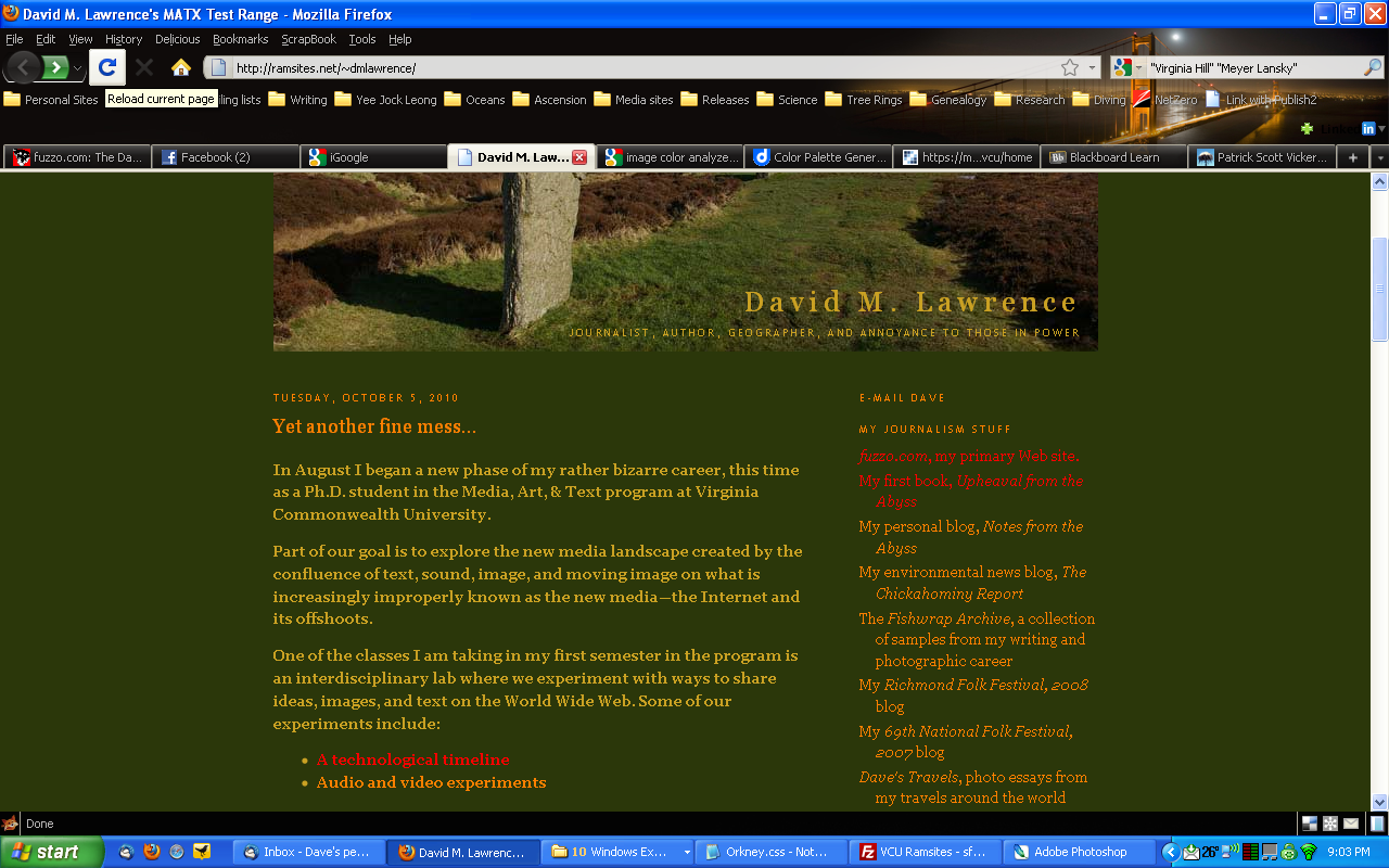
The look and feel was taken from a photograph I took on the island of Mainland, in Orkney, Scotland. It is of a portion of the Ring of Brodgar. In addition to being a journalist, I am a physical geographer by training, and draw a significant amount of inspiration from natural landscapes. This landscape, in particular, is stark, beautiful, and haunting—haunted by the "ghosts" of those who erected the stones that make up the ring nearly 5,000 years ago, as well as by those who have lived there since.

I began this experiment when designing a template for my site on the social network Bebo. Using an earlier version of the photo, I used reds and browns from the image for backgrounds, and the mustard colors on the stones for text. In my initial design for this site, I used the same scheme, but some commented that there was insufficient contrast between the color of the type and the background.

Recently, I reworked the original photo—using better color correction than I had previously. I tested several color combinations from the reworked photo to produce what you now see. I think the contrast is much better in this case. In addition, the link-related colors are also drawn from the photo—they were not in the original scheme. I realize that some people prefer dark type on a light background, but for me I prefer light type on a dark background. Light type on a dark field also creates more of gallery feel to me.
For the sections of the site, I have divided it into The Front Page, Pulp Nonfiction, Noises & Signals, Static Images, Moving Images, Flashimation, and the Usual Suspect. The titles combine elements of description with my sense of humor.
- The Front Page is analogous to a print publication's front page, or in this case, the site's home page.
- Pulp Nonfiction is the home for display of the writing and presentation projects I have worked on in my classes. I may include samples of other relevant written work here, too.
- Noises & Signals is the location where audio projects I work on will be displayed.
- Static Images is where I plan to display photographic projects I work on while in the program. At this point, I have a sample from one shooting excursion in September. I have copied HTML structures I have designed and used in an ongoing project of mine, which uses tables for formatting and javascript code for navigation. While I intend to keep the javascript navigation code, I would like to move away from tables to CSS to control positioning of elements. I have not had time to devise the CSS controls, however.
- Moving Images is for display of movies I create in the MATX program.
- Flashimation is a somewhat whimsical term I coined for the page where I will diplay Flash and other animation and interactive projects.
- The Usual Suspect page is the home of my biographical information.
In the footer you will note my promotion of adherence to HTML and CSS standards. I will periodically test my pages to ensure compliance with World Wide Web Consortium (W3C) guidelines.
